Early Learning Resource Unit
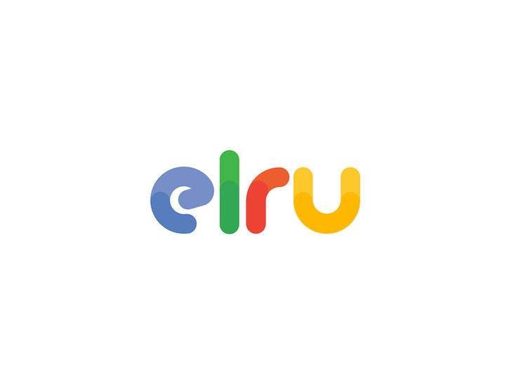
The Early Learning Resource Unit (ELRU), a nonprofit organization established in 1978 with over four decades of experience in early childhood development, commissioned a comprehensive redesign of their brand identity. The goal was to invigorate their existing color palette of blue, green, red, and yellow. The new logo features a simplified wordmark with a custom rounded font, embodying the approachable and nurturing essence of ELRU. Circular shapes, symbolizing wholeness, perfection, completeness, community, and inclusivity, are the primary design element. The vibrant colors and playful combinations enhance the brand’s appeal and recognizability.
The redesign includes a cohesive visual identity system that spans identity and illustration, custom patterns, icons, website, interior and exterior branding, and explainer videos. This refreshed identity successfully brings ELRU’s mission to life, making it more accessible and engaging, while reflecting the organization’s commitment to supporting the cognitive development and executive functioning skills of vulnerable young children by building the capacity of the adults around them.
Website
Branding/Identity Typography Print website design and development Explainer videos


